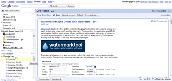
After the redesign of Analytics and rolling out themes for Gmail, now it was the turn of Google reader to get a new look. Google has rolled out a new look and feel for its feed reader. As per Google, they have removed some visual clutter, simplified some features and given everything a bit more breathing room. The old rounded corners, drop shadows and heavily saturated colors are also removed.
Apart from the visual changes, there is also the collapsible navigation which is pretty good feature.
Some of the other changes are;
- The “Refresh” button from the subscription list is now in the Subscriptions options menu or triggered by simply clicking on the word “Subscriptions”
- The “Show all – updated” controls are now in the Subscriptions options menu.
- The “Add subscription” button has moved to the top of the navigation pane.
More details can be found at the Google Reader blog.

