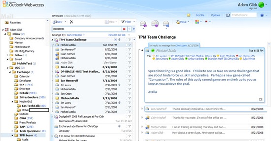
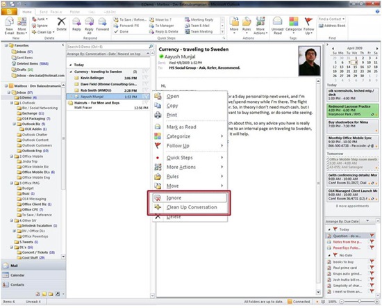
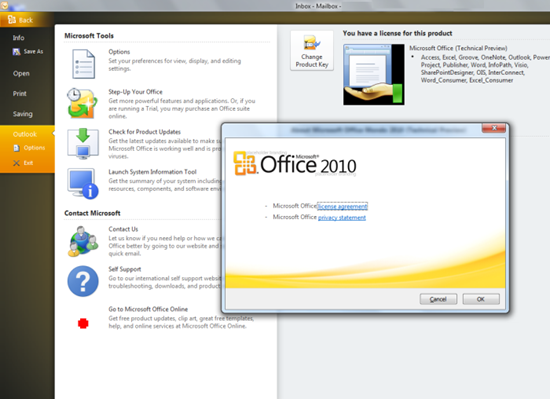
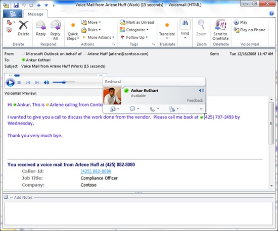
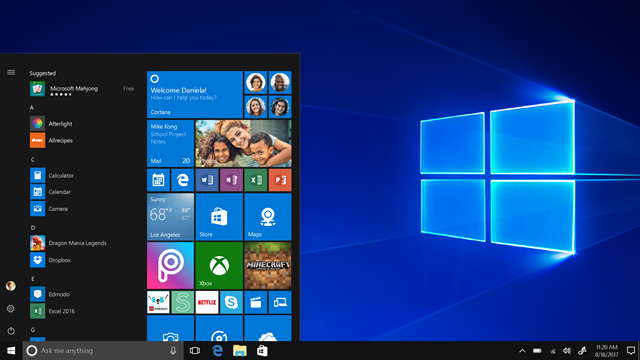
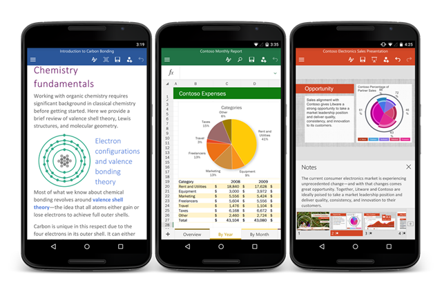
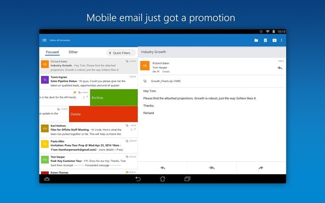
Office 2010 is the upcoming version of the popular Microsoft Office suite is in testing stage and the public beta is expected to be available some time later this year. Meanwhile Microsoft has posted some screenshots of the look and feel of the new version of Office. There are many changes to the new version when compared to Office 2007. Here are some of the screenshots of Outlook 2010.
Source Neowin and Microsoft Press Pass



im so excited for this version of microsoft office!
Would by nice if they implement a option to get back the classic look.
Can’t work with the new interface –> OpenOffice.org
It looks great!
@Hannes,
I dont think Microsoft will ever go back to the classic interface. The new interface has lots of improvements
@Dmitry: I know =/
The new interface is handy for “normal” users but the classic look was much better for experienced users.
@Dmitry; Hannes,
Afraid of change are we ;)… if your truly an experienced user you should’nt have to worry about appearance, the shortcuts will be the same
yeah well Hannes.. I am an experienced user, and I hated it from the beginning. My keyboard shortcuts aren’t the same, and I’m far less productive. I’d love an option.
Option 1
Stop buying [encouraging Microsoft] the applications you don’t like. Find an alternative to utilize the same formats. There are many free options.