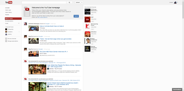
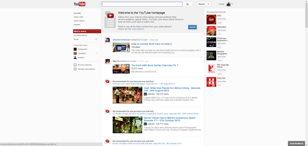
Few days back, Google has rolled out a new design for YouTube which makes the content left aligned. This new design is in tune with the Google+ layout which was rolled out months back. The main problem with the new alignment is that since the content is aligned to left, there is lot of white space in the center making it less usable.
This new design looks really bad on large monitors, especially if you have a 23 or 25 inch. The Google+ design when rolled out had got severe criticism from users and the same thing has happened with new YouTube layout as well. Many users are not happy with the left aligned layout.
Now if you are a YouTube user, who is not happy with the new layout, you can get back the old centered layout using the user scripts. Youtube Center Aligned is a new user script for Google Chrome and Firefox which can center align the new YouTube layout.
As you can see from the image above, there is so much white space at the center of the screen and once you install the script, you can see the layout center aligned making it more usable.
How to Install the Script:
1. Firefox Users:
For Firefox, you first need to install the Greasemonkey add-on and once installed, you can simply click on the Install user script button. Refresh the YouTube page once you have installed the script.
2. Chrome Users:
Since Chrome does not allow you to install scripts from any external sources other than Chrome store, you need to open the extensions page (Tools-> extensions). Now drag and drop the downloaded script on to the extension page and install it. Refresh the page once the extension is installed.


it is easier for chrome users to install “Stylish” extension and use this style http://userstyles.org/styles/79568/youtube-center-aligned-new-style-fix-dec-6