WordPress has been the most popular tool for blogging with tons of themes and plugins available for customization. WordPress has grown considerably since it was first released. With every release, we get to see new features being added. But one area where not much changes has happened is the WordPress admin area. The default theme has been there for year now without much changes. But with the upcoming version of WordPress, 3.6 things are going to change. Matt has already mentioned that they are working on a new UI for the admin area in WordPress.
As a part of first iteration, Matt has released a plugin called MP6, which gives a refreshing make over for your WordPress dashboard. Although this is not the final version of what would be the looks of WordPress 3.6, you can still try this plugin.
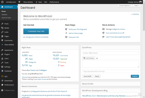
As mentioned by Matt Mullenweg, this plugin is not for general public, but for WordPress enthusiasts eager to preview or contribute to a re-imagination of the collective home, wp-admin. Here is what’s new in this;
- A visual treatment for the toolbar and menubar that visually unifies the two and reduces clutter.
- Flatter visual styling, with square corners, for tables and grouping elements like
.postbox. - Increased saturation of the traditional WP blue (old vs new comparison: http://cl.ly/image/1X2G3X1Y0y2g ).
- A splash of color to denote the current menu item. (gasp)
- Removed the burnt orange hover state in favor of a lighter blue.
- Single-color icons are now served via an icon font, making them load instantly and look crisp at any zoom factor. (The speed is noticeable on slower connections, like Gogo.) We can also use these for mobile apps.
- Consistent typography for all operating systems by including the Open Sans web font. (Cognizant of complications embedding this could entail.)
- Added padding between links in the menu for easier touch navigation, important as the majority of internet interaction will happen on touch devices within a few years.
- Lightened the page background using white backgrounds for grouping elements and a gray background for the body.
- Removed the large header icons for a cleaner look at the top of the page. Reduce, reuse, recycle.
Matt also mentioned that the upcoming dashboard will not have the blue variant like the current one. There is no mention on when 3.6 would be available. But this plugin definitely brings some freshness to the otherwise boring dashboard colors. We are hoping that it would be much more polished in the final version.
You can install this plugin and try out the new look.

