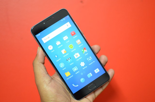
Meizu announced the M3 note in India last month and this is the successor to M2 Note released last year. M3 Note comes packed with good specs for a phone in this segment and has 5.5 inches Full Hd display, MediaTek Helio P10 Octa-core chipset coupled with 3GB RAM and 32GB storage. The device is priced Rs 9999 and available exclusively on Amazon.
So how does Meizu M3 Note perform and does it stand up against the competition? Let’s find out in this review.
Here is the video review.
Design and Build:
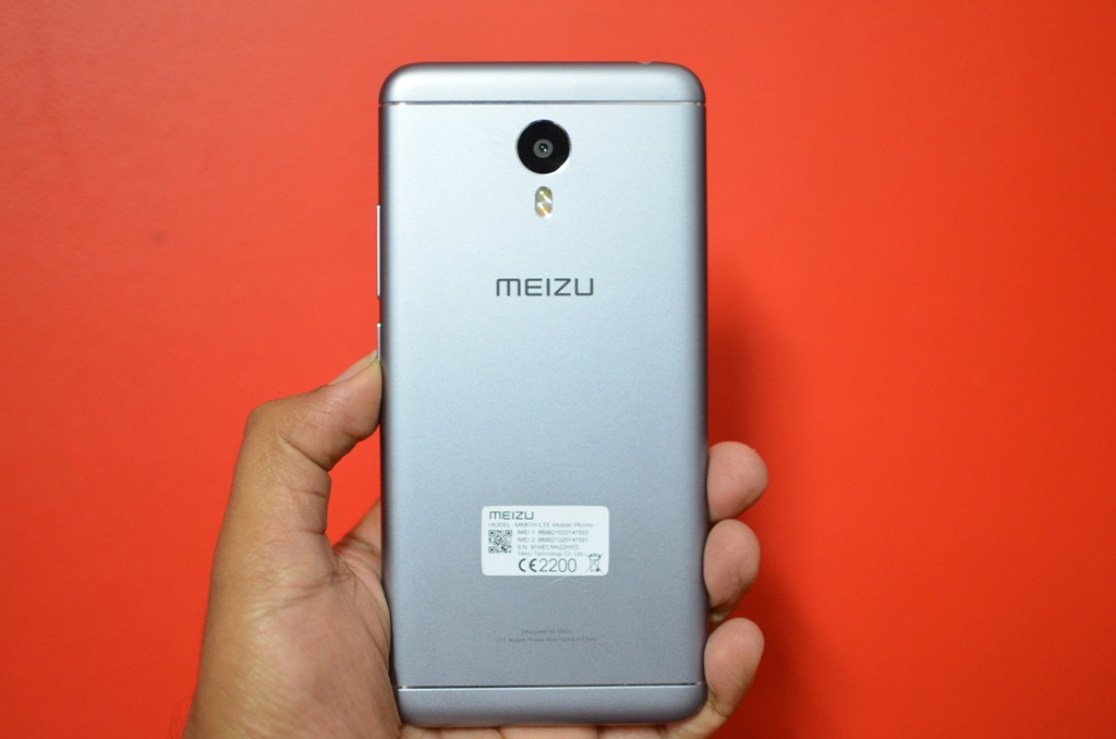
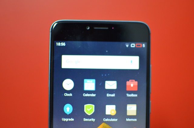
Meizu M3 Note is definitely one of the good looking devices in the sub 10k price point in India. While there isn’t anything new in the design language it definitely looks good in the all-metal unibody design. There are a subtle resemblance in the design with Meizu’s own MX5 and also the iPhone 6S.
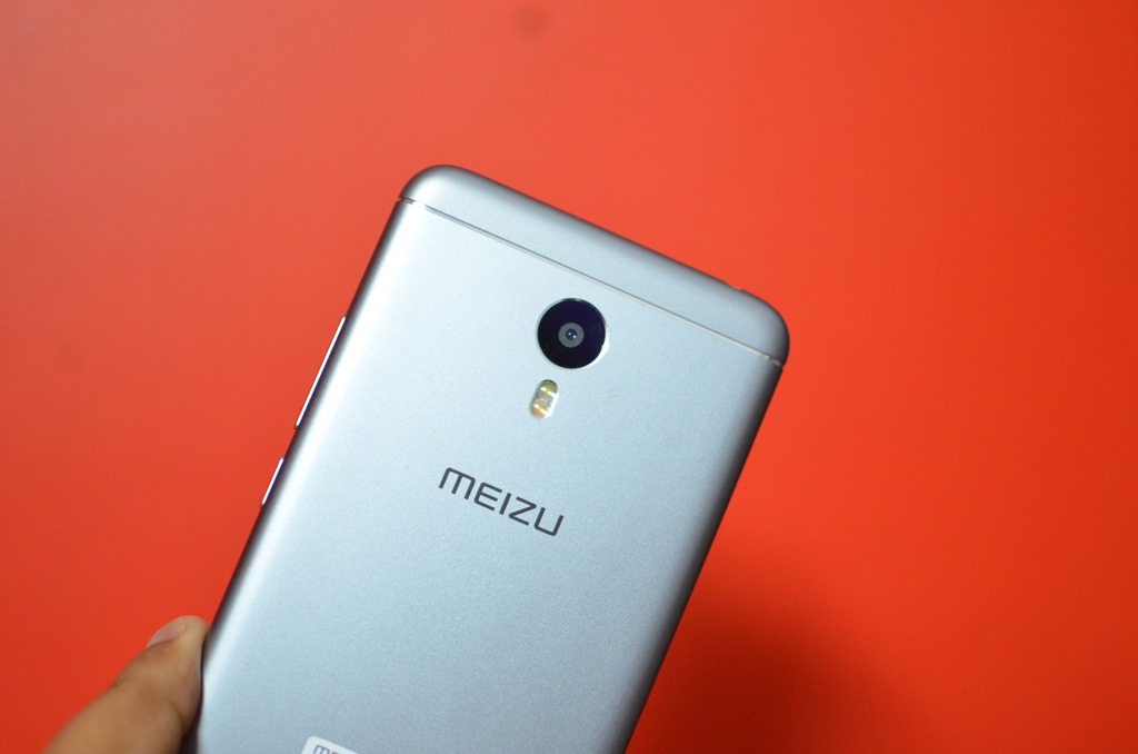
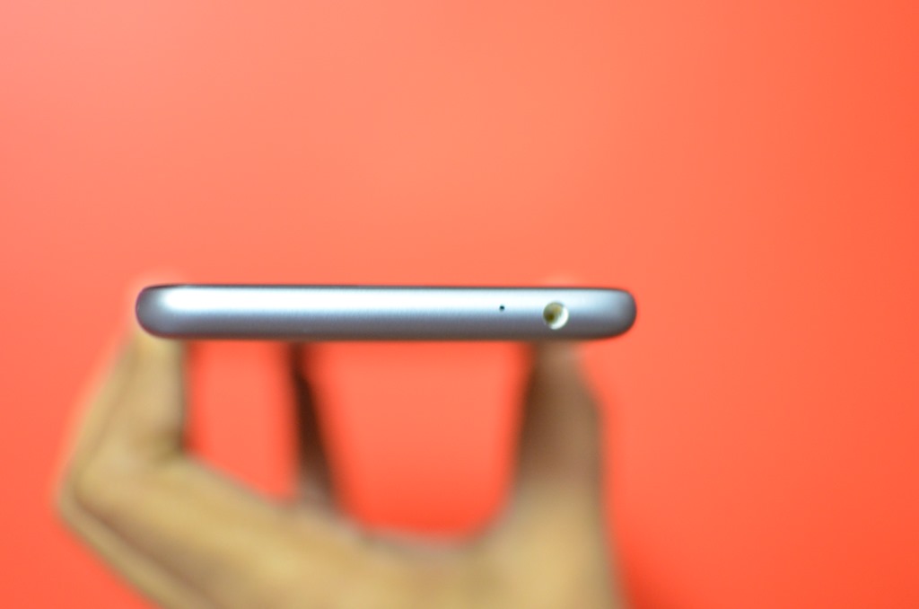
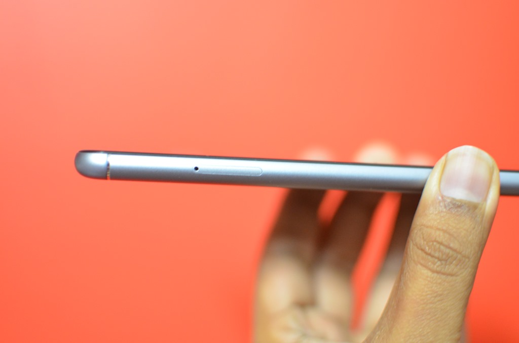
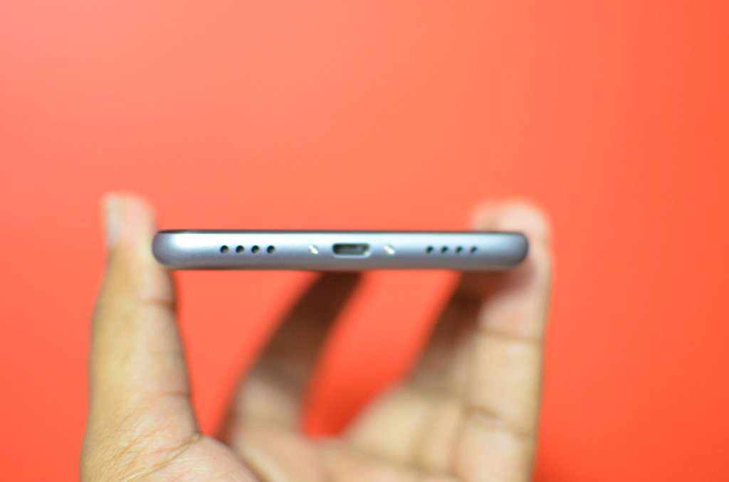
The phone has SIM tray on the left side while the power and volume keys are placed on the right side. At the bottom, we have micro USB charging slot and speaker unit, while the 3.5mm audio jack is located at the top. The rear panel has a matte finish and houses the 13MP camera, LED flash and Meizu logo.
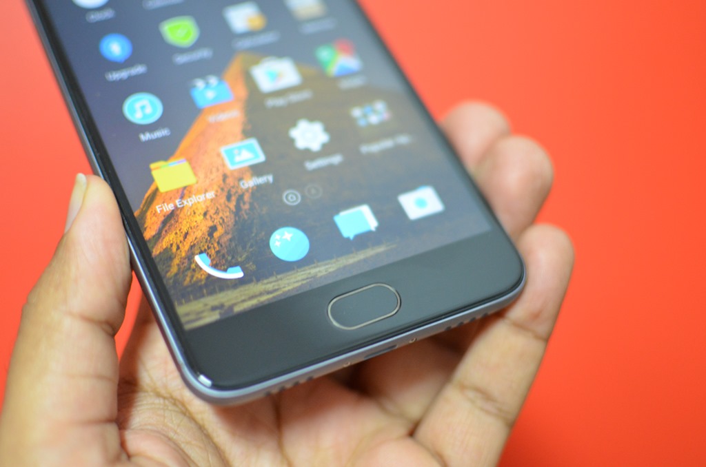
The phone has a physical home button and does not feature any back or multitasking buttons. The home button is mTouch button which acts as a home, back and fingerprint scanner. It works pretty well and the same way it is advertised. The phone has rounded edges and does feel a bit slippery when holding in the hand. Overall, the design and build quality looks good.
Display:
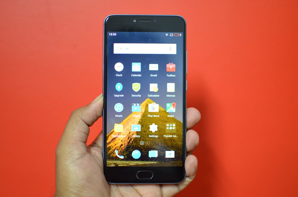
The Meizu M3 Note comes with a 5.5″ LTPS IPS LCD panel of 1080p resolution and a pixel density of 403ppi. The colors are nicely saturated and the viewing angles are quite good for a budget phone. But the outdoor performance was just average with a reflective display and the brightness levels are low.
The touch response is quite smooth on the display. The display is also protected by a scratch/shock resistant glass.
Software:
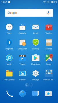
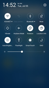
Meizu M3 Note runs on Flyme OS on top of Android 5.1 Lollipop. When we reviewed Flyme OS last year, we mentioned that the UI is slightly confusing as it has the look and feel of iOS to an extent. But with the latest version of Flyme OS, things have changed drastically with respect to the UI. Now it looks more or less like the Android UI with a customized look. The notification center is also a custom one.
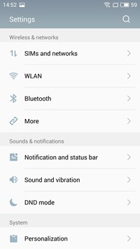
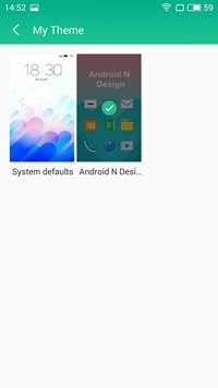
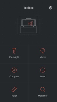
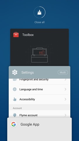
The settings panel has all the options available for an Android phone, but there aren’t any added features or gestures supported on the phone. There is also support for themes and you can do a bit of customization on your phone. The phone also comes with Toolbox app which provides all the needed apps like flashlight, mirror, compass, level, ruler and magnifier.
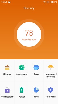
There is also a security app which provides options like cleaner, accelerator, call blocking, power manager and also the anti virus.
Performance:
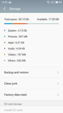
Meizu M3 Note powered by the MediaTek Helio P10 Octa Core processor coupled with 4GB of RAM and it supports 4G LTE along with dual SIM cards. There is 32GB onboard storage out of which around 24GB is available to the user.
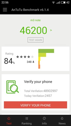
Talking about the performance of the device, the phone performed quite well in day to day tasks like browsing, calls, social networking, camera usage etc., as it has 3GB of RAM. But even with 3GB of RAM, the gaming performance was quite average. We tested high graphic rich games like Asphalt 8 Airborne and we could clearly see the device lagging and this could be attributed to the Helio P10 which isn’t a great mid range performance when compared to Snapdragon’s 650 or 617.
But at the same time, heating on the device was well under control and no major issues. The call quality on the phone was quite good and so were the speaker unit located at the bottom. The phone packs Wi-Fi, Bluetooth while NFC is missing on this device. The fingerprint sensor is located on the physical home button and it works very well. You can add multiple fingerprints to unlock the device. The home button is also called mTouch button which acts as a home, back button and fingerprint scanner. There are no capacitive buttons for back and multi-tasking. If you want to switch between apps, you need to swipe up from either side of the home button.
Camera:
Meizu M3 note packs a 13MP rear camera with a five-element lens with EIS (electronic image stabilization). The front facing camera is at 5MP for selfies. The camera interface is quite good for a budget offering. There are plenty of modes and options to choose from.
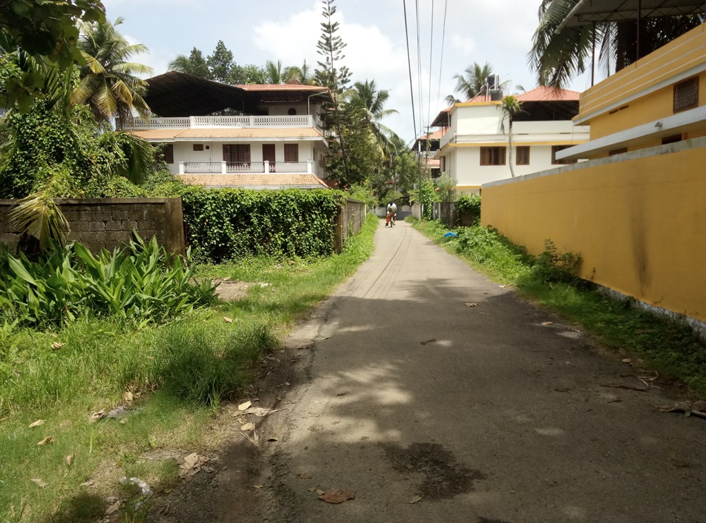
Now talking about the camera samples, the daylight shots have decent colors and overall clarity. The sharpness levels could have been a tad better, but overall quite decent. But the colors aren’t consistent and some photos ended up being washed out. The low light photos were also average for a phone in the price segment. Overall, we were quite disappointed with the camera on M3 Note. The front facing camera is also good for selfies and does a good job.
Battery Life:
The Meizu M3 Note comes with a 4100mAh large capacity battery. The battery performance of the device is good and you can easily get at least 1.5 to 2 days of battery life with moderate usage. We tested with the usage of social networking apps, calls, gaming, taking photos and also browsing.
Overall, the battery performance is one of the strong aspects of the phone.
Verdict:
Meizu M3 Note is one of the well-built and beautifully designed phones. But where it falls short is the performance and camera. We are expecting Meizu to release an update for fixing the camera issues. Priced at Rs 9999, Meizu M3 Note is a decent offering with good design and build, display and battery life, but definitely, it is not an all-round performer device at 10,000.

